You Found Out You're a True Spring — Now What?
You Found Out You're a True Spring — Now What?
The frustrating gap between knowing your colors and actually finding them in stores
Getting your colors done feels like a revelation. Suddenly everything makes sense — why that coral blazer made you look incredible, why you've been avoiding black your whole life without knowing why, why certain greens make you glow and others make you disappear.
You leave your color analysis session with a palette card, a season name, and a head full of excitement. You're a True Spring. Now you just need to go shopping.
And then reality hits.
The problem nobody talks about
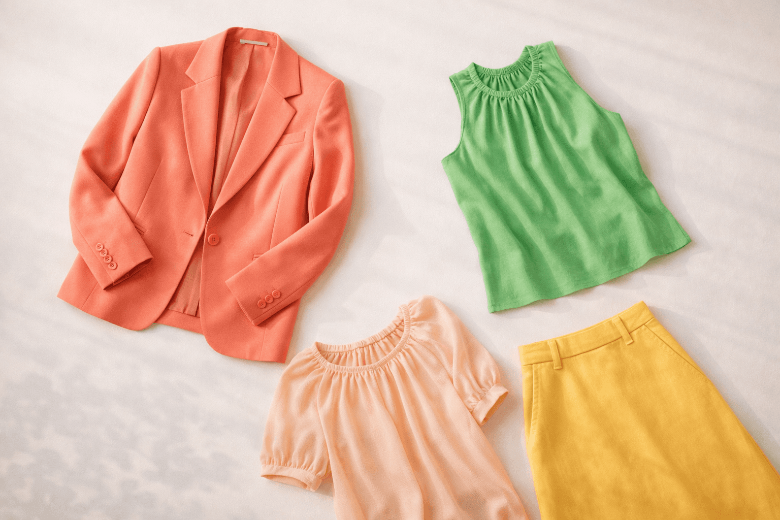
You walk into Zara. You're looking for warm, clear, golden-toned colors — coral, warm yellow, fresh green, camel, teal. What you find is a rack of colors described as "ecru," "stone," "dusty rose," and "forest."
Is ecru warm enough? Is this green too blue? Is that red too dark or too muted? You hold things up, you squint, you put them back. You leave with nothing, or worse — you buy something that seemed right in the store lighting and looks completely wrong at home.
This is the True Spring shopping problem. And it's real.
Why shopping for your season is so hard
There are a few reasons this happens.
Color names are meaningless. "Rust" can mean a warm True Spring orange or a muted Soft Autumn brown — completely different things. "Blush" can be a warm peach or a cool dusty rose. The name tells you nothing about whether the color actually suits you.
Store lighting lies. Artificial lighting shifts colors dramatically. A warm coral can look almost neutral under fluorescent lights. A cool pink can look peachy and warm. You simply cannot trust what you see in the store.
Online shopping is even harder. Screen calibration, photo editing, different lighting setups — the "coral" dress you order online arrives and it's actually a cool salmon that does nothing for you. Returns are a pain and you waste money.
Brands don't think in seasons. They think in trends. This season's "color story" might be full of cool mauves and icy blues — beautiful for a True Summer, terrible for you. There's no filter that says "show me only the warm, clear shades."
What actually works
After a lot of trial and error, here's what True Springs have figured out:
Natural light is non-negotiable. Before buying anything, get to a window. Hold the garment near your face in daylight. If it makes your skin look warm and alive — it's yours. If something feels off, trust that feeling.
Learn to read undertones, not color names. Train your eye to spot warmth. Every color in your palette leans golden or yellow — even your greens should lean lime rather than forest, your pinks should lean peach rather than cool rose. Forget the name on the label and look at the actual hue.
Shop by fabric swatch, not screen. For online shopping, if a brand offers fabric swatches or detailed color descriptions, use them. Some brands like & Other Stories describe their colors as "warm terracotta" or "cool slate" — those descriptors are gold.
Screenshot and compare. Take a photo of your palette card and keep it on your phone. When you're unsure about a color, hold your phone next to the garment and compare. It's not perfect but it helps.
Shop in daylight hours online. Sounds odd, but viewing product photos on your screen in natural daylight gives a more accurate read than viewing them in the evening under artificial light.
The brands that tend to work for True Spring
Some brands naturally skew warm and clear in their color palettes — making them happy hunting grounds for True Springs.
Zara regularly does warm coral, camel and golden yellow especially in spring and summer collections. Their basics in warm white and ivory are reliable staples.
Mango leans Mediterranean and warm — lots of terracotta, warm orange, olive and camel. Hit or miss depending on the season but worth checking regularly.
& Other Stories has a more considered approach to color and often carries warm, clear shades that work beautifully for True Spring.
ASOS is overwhelming but has everything — the trick is filtering aggressively by color and then sorting through carefully in natural light.
COS tends toward cool and muted which is less ideal, but their warm neutrals — camel, ivory, warm beige — are excellent quality.
Essential Antwerp brings a warm, earthy palette with lots of camel, rust and golden tones — a reliable source for True Spring neutrals and statement pieces.
Fabienne Chapot is practically made for True Springs — their signature warm prints in coral, yellow and fresh green are some of the most palette-perfect pieces you'll find on the Dutch high street.
The honest truth about building a True Spring wardrobe
It takes time. It takes returning things that don't work. It takes standing in fitting rooms in natural light holding things up to your face like a slightly unhinged person.
But once you start finding your colors — really finding them — the difference is undeniable. People ask if you've been on holiday. You look healthier, more awake, more like yourself. It's worth the effort.
The frustrating part is that the effort is mostly in the finding, not the wearing. The clothes exist. They're out there in stores and online right now. The problem is there's no easy way to filter the entire internet by "warm, clear, medium value."
That's the exact problem we're building Season Closet to solve — an automatic color filter for your wardrobe, matching new arrivals from your favourite stores to your True Spring palette every single day.
Join the waitlist at seasoncloset.com — and never spend an afternoon squinting at ecru again.